React, Typescript, Tailwind CSS
Your Design System Is Not the Components. It's the Tokens.
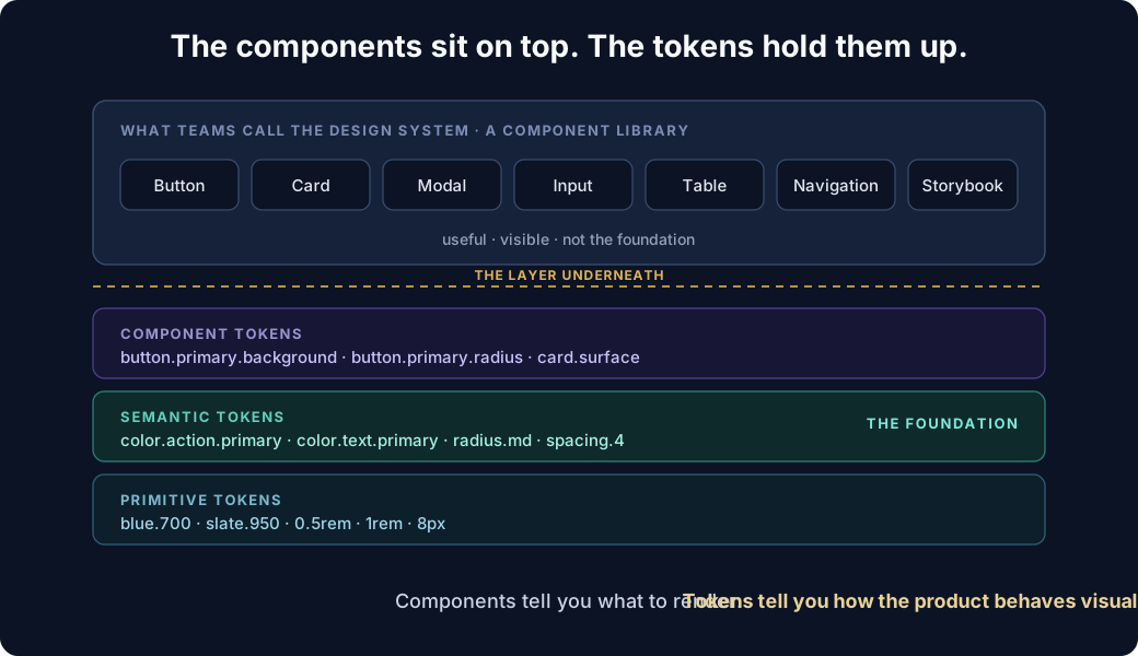
A lot of teams say they have a design system when what they really have is a component library.
They have:
- Buttons
- Cards
- Modals
- Inputs
- Tables
- Navigation
- Maybe a Storybook
That is useful. But it is not the foundation of the design system.
The real foundation is the layer underneath all of those components: design tokens.
Tokens are the shared language
Design tokens are the shared language that connects design decisions to implementation.
Instead of saying:
background: #0f172a;
border-radius: 8px;
padding: 16px;
you define intent:
background: var(--color-surface-primary);
border-radius: var(--radius-md);
padding: var(--spacing-4);
That small change becomes extremely important as an application grows.
Components tell you what to render. Tokens tell you how the product behaves visually.
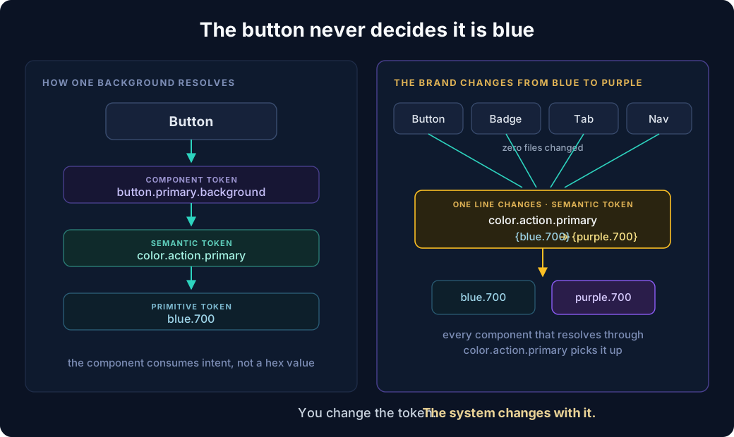
A component library might define a Button. But the button should not decide that its background colour is blue. It should consume something like:
Button
  ↓
component token
  ↓
semantic token
  ↓
primitive token
For example:
button.primary.background
        ↓
color.action.primary
        ↓
blue.700
This separation matters.
If tomorrow the brand changes from blue to purple, you should not have to modify every button, badge, tab and navigation component. You change the token. The system changes with it.
A practical token architecture
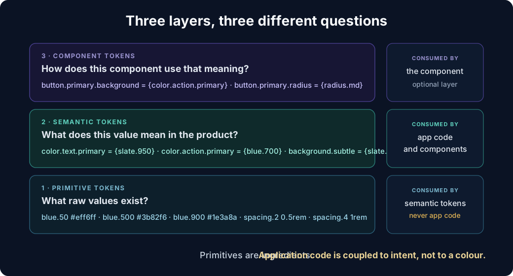
A scalable design system usually benefits from three layers.
1. Primitive tokens
These are raw values.
{
  "blue": {
    "50": "#eff6ff",
    "500": "#3b82f6",
    "900": "#1e3a8a"
  },
  "spacing": {
    "2": "0.5rem",
    "4": "1rem",
    "6": "1.5rem"
  }
}
Primitive tokens generally should not be used directly by application code. They are ingredients.
2. Semantic tokens
Semantic tokens describe meaning.
{
  "color": {
    "background": {
      "default": "{white}",
      "subtle": "{slate.50}"
    },
    "text": {
      "primary": "{slate.950}",
      "secondary": "{slate.600}"
    },
    "action": {
      "primary": "{blue.700}"
    }
  }
}
Now your application is no longer coupled to a specific colour. It is coupled to intent.
That is a much more stable abstraction.
3. Component tokens
For larger systems, components can add another layer.
{
  "button": {
    "primary": {
      "background": "{color.action.primary}",
      "foreground": "{color.text.inverse}",
      "radius": "{radius.md}"
    }
  }
}
This allows component behaviour to evolve without changing the underlying global semantics.
Each layer answers a different question
Primitives answer what values exist. Semantic tokens answer what this value means in the product. Component tokens answer how this particular component uses that meaning. Application code should only ever be talking to the top two - the moment it reaches down to a primitive, the abstraction has leaked.
Why this becomes critical in white-labelled products
This is where design tokens stop being a design-team convenience and become an architecture decision.
Imagine a platform serving multiple organisations. Each organisation may want:
- Different colours
- Different logos
- Different fonts
- Different border radii
- Different navigation styling
- Light or dark modes
- Product-specific themes
Without tokens, white-labelling quickly becomes:
if tenant === schoolA ...
if tenant === schoolB ...
if tenant === customerC ...
That approach does not scale.
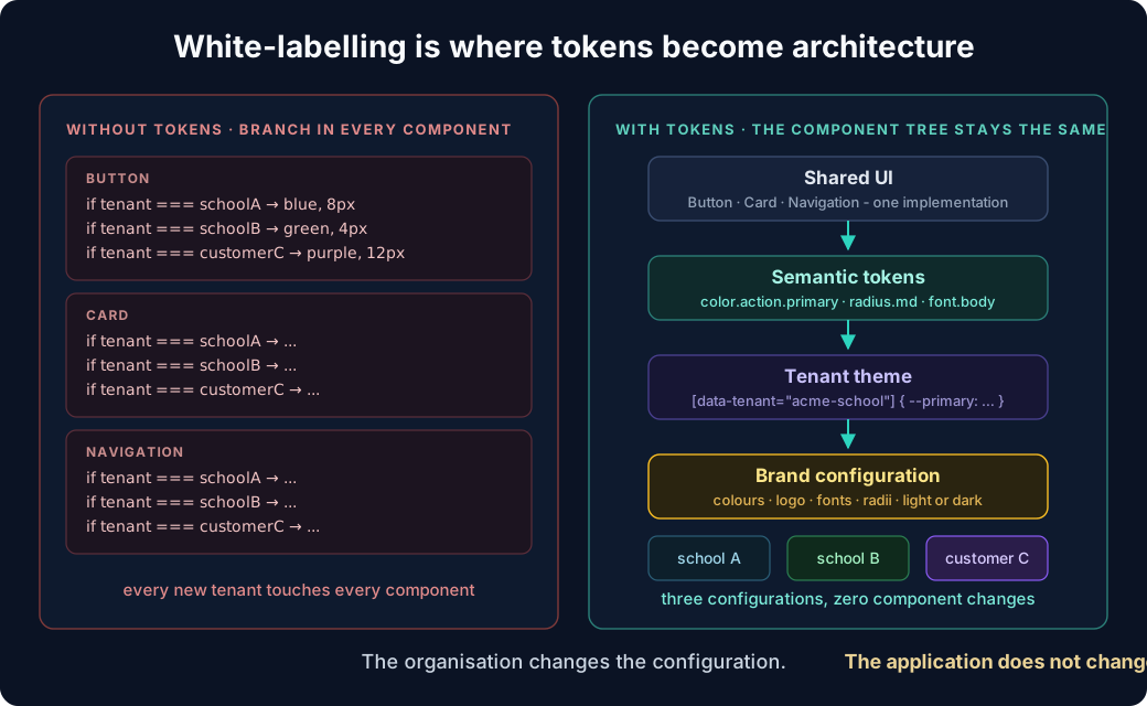
With tokens, the component tree stays the same.
Shared UI
   ↓
Semantic tokens
   ↓
Tenant theme
   ↓
Brand configuration
The organisation changes the configuration. The application does not change.
Design tokens also create boundaries
One of the biggest benefits is preventing application developers from accidentally creating a second design system inside the product.
Instead of:
<div className="bg-[#15254c] rounded-[11px] px-[17px]">
you want something closer to:
<div className="bg-surface rounded-md px-4">
or:
<Button variant="primary" />
Developers choose intent, not arbitrary visual values.
That gives the design system something incredibly valuable: control over entropy.
Arbitrary values are a second design system
Every bg-[#15254c] in application code is a design decision that the design system does not know about. One is harmless. Two hundred of them, across four applications, is a shadow design system with no owner, no theme support and no way to rebrand. The token layer is only a boundary if the escape hatch is treated as a code-review defect.
Tailwind and shadcn make this even more useful
A stack such as:
React
+
Tailwind CSS
+
shadcn/ui
+
CSS variables
+
Design tokens
works extremely well for this model.
shadcn provides the component foundations. Tailwind provides the utility layer. CSS variables become the runtime token interface.
Your theme might expose:
:root {
  --background: 0 0% 100%;
  --foreground: 222 47% 11%;

  --primary: 221 83% 53%;
  --primary-foreground: 210 40% 98%;

  --radius: 0.75rem;
}
A tenant can then override those values:
[data-tenant="acme-school"] {
  --primary: 265 80% 50%;
  --radius: 0.5rem;
}
The components remain untouched.
That is the important part.
Tokens should go beyond colour
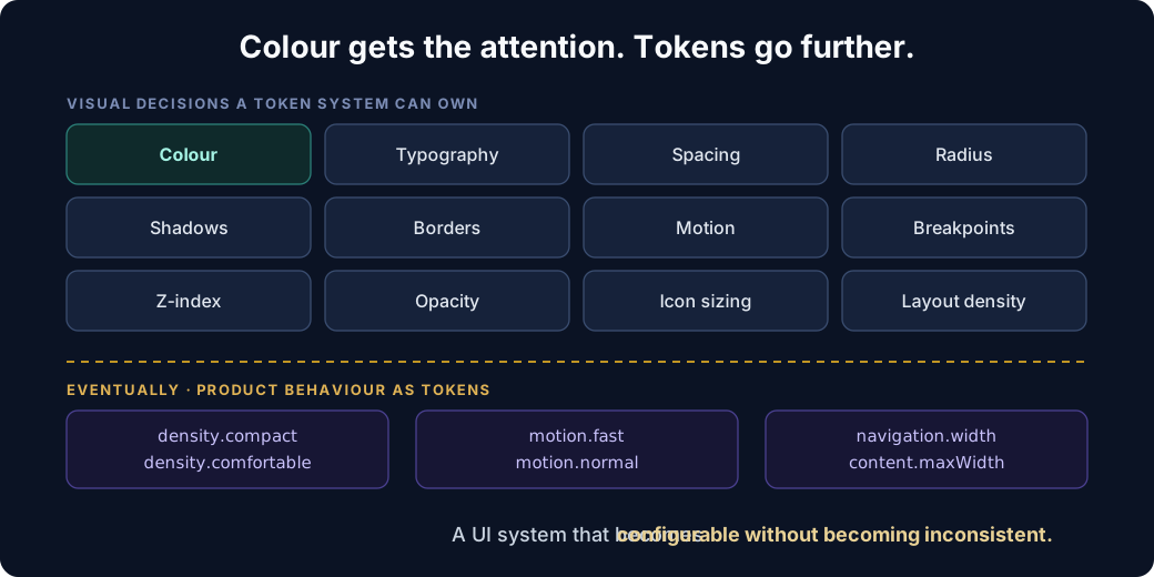
Colour usually gets the attention, but a mature token system can represent much more:
Colour
Typography
Spacing
Radius
Shadows
Borders
Motion
Breakpoints
Z-index
Opacity
Icon sizing
Layout density
Eventually you can even represent product behaviour such as:
density.compact
density.comfortable

motion.fast
motion.normal

navigation.width

content.maxWidth
The result is a UI system that becomes configurable without becoming inconsistent.
The interesting architectural shift
The traditional UI architecture looks something like:
Designer
   ↓
Figma
   ↓
Developer
   ↓
CSS
A token-driven architecture looks more like:
Design decisions
        ↓
Design tokens
        ↓
Theme configuration
        ↓
Component library
        ↓
Applications
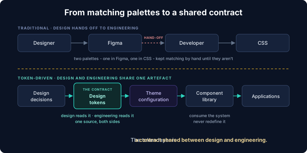
Now the token layer becomes a contract shared between design and engineering.
That is much more powerful than simply maintaining matching colour palettes in Figma and CSS.
Treat the design system like a platform
Once multiple applications consume the same UI kit, the design system should be treated almost like an internal platform.
For example:
packages/
  design-tokens/
  ui/
  icons/
  typography/
  themes/

apps/
  admin/
  student/
  parent/
  teacher/
Applications should consume the system. They should not redefine it. If you want a vocabulary for what the system contains, Atomic Design supplies one - atoms, molecules, organisms - and tokens are what sit beneath the atoms.
The moment every application starts introducing its own colours, spacing rules and component variants, the design system starts fragmenting. This is the same line drawn in micro-frontends without duplicating your React code: the design system belongs in the shared code boundary, and tokens are the part of it that must be shared most strictly of all.
The rule I would use
A simple rule for engineering teams:
If a visual decision is likely to appear more than once, it probably deserves a token.
And another:
Application code should express intent. The design system should decide appearance.
That distinction makes design systems significantly easier to scale. Especially when you're building multiple products, multiple themes or a white-labelled SaaS platform.
The button component is useful.
The token that controls every button across every application is the actual leverage.
That is where the design system starts becoming architecture.